The lights go out at Lotus
by Volker Weber
Before: 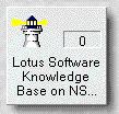 and after:
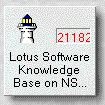
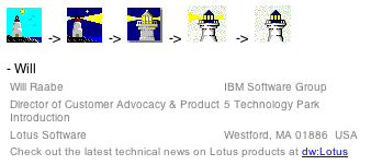
Update: Will Raabe of IBM has commented below and followed up with this email documenting how the icon of the knowledgebase has changed over the years:
Comments
I just checked the icon on my workspace, and sure enough, the light is gone. Gosh, what is the symbolism here? I liked it better the old way; it seemed like such a meaningful icon. Oh well.
will the last person leaving lotus please turn out the lights . ..
Hmm, I thought it was odd the light went in two directions, which they usually don't from a lighthouse. I like it better now, I think, aside from the symbolism.
As a matter of fact, a lighthouse light does go in many directions to form the light characteristic. It doesn't do that in Disney movies however. :-)
I suppose it's better than , the lights on but nobody's home...
I actually wonder where from you've got the old image. Do you regularly take screenshots of your workspace? ;-)
Hi all. I am the exec at IBM responsible for the team that owns the design of KBase within the Lotus brand. The change you noticed is actually one in a series of changes that have been happening over time. We have been working to graphically improve the icon used in KBase to a more "professional" & cleaner looking icon. There is no hidden meaning here but your comments did make me chuckle.
I have a nice set of icon snapshots that show the progression of design changes. I would be happy to send them along if you would like to see them and judge for yourself.
Thanks again for noticing our changes. I hope the data inside KBase remains useful to you regardless of the icon.

