Bad web design ideas
by Volker Weber
I see a disturbing trend to bad web design with most of the Domino blog templates. Some of these issues can be easily fixed however.
Too many fonts. This is a problem which is very easy to solve. Reduce your design to one single font, two sizes, two weights, two colors. Smaller size for regular text, large size for banner. Normal weight for bodytext, heavier weight for headlines. One color for regular text, second color for links. Do not use underlines for anything but links. Here is one example that gets the fonts right but makes a different mistake:
Too many lines. This is a bit harder to fix. Developers tend to think in block constructs. The too many lines problem is a designer's representation of these nested blocks. It is amazing what you can do if you draw white lines on white background. You get the same nested structure without the lines. It is called spacing. :-) Which leads us to issue #3:
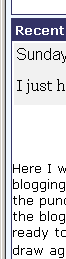
Bad spacing. This is the hardest one to fix. Generally people tend to put things too close to each other, just in order to get more text on the screen. In this example there is a thin line very close to the border of the screen. You could leave that away without losing anything. Then there is no spacing at all between the body text and the line, which is both ugly and makes the text hard to read. Finally there is way too much spacing between the header and the body text.
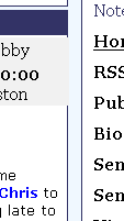
Bad line spacing. This one is easier to avoid. You have to have an indication of a new paragraph at the left side of the text. The easiest way to do that is an empty line. If you don't want that, you can also use a first line indent. But you absolutely need to have that indication. Otherwise the text will be hard to read and it also will not look very good.
The general idea would be: Keep it as simple as possible. It is much easier to make a clean design with very few features. The more things you add the more complicated it gets. This is an example of an excellent design with many features, and this is a good example of a clean and simple design.
Comments
Now all us Blog developers can have fun trying to find which sites the screenshots were from :)
The second problem that you mention with 'Lines' can be quickly solved with BlogSphere as it is all CSS controlled. White lines on a white background is no problem.
For the third problem you mention that there is a lot of space between the header and the body of the text. This is something that will happen in both BlogSphere and DominoBlog. It is due to the RichText to HTML conversion. Domino adds a few linefeeds to the start of the text and there is no way of getting rid of them.
Some good points, especially the font and spacing issues. I don't entirely agree on the box thing however - boxes are fine provided that you don't have too many of the things!
Your example sites are interesting - while interesting, neither are perfect examples - Antipixel is a font bitch with a bloody aweful font choice and Dangerousmeta while not a bad design, does something quite disconcerting (DUMB!) with the cursors.
Of course, like choosing a mate - beauty is most definately in the eye of the beholder.
You should have used your own site as an example - much closer to your ideals I think - go on, blow that trumpet - we know you want to! ;-)
I agree with you on the cursor issue with dangerousmeta.
I actually wanted to use your site as an example for a site that uses boxes rather well. But I learned it is not good to like certain Domino designs and dislike others. The developers are too competetive. But they should all improve on their designs.
No, I cannot use my own site as an example. Of course it is closer to my ideals but I still need inspiration.
Colin, and while we are at it. Just for kicks: Draw your boxes white on white. You will see that you don't lose anything at all. And that means you don't need them. Your text is justified on both sides and that works without a box around it even better.
I think many of the designs come about they way the do because they try to "hand hack" the CSS - I could be wrong but I didn't really get any grasp of things until I invested some money in TopStyle - excellent tool that I could not do without.
Thanks for the complement BTW! I have taken your challenge (if very quickly) - I'm not entirely convinced but it does have some merit - more tweaking definately required.
Oh and thanks for making me think outside the square! ;-)
"Domino adds a few linefeeds to the start of the text and there is no way of getting rid of them." Yes, Domino has sometimes unwanted outputs in HTML, such as inconsistent linefeeds. In the middle of a text one line space is sometimes larger than the others.
Colin,
I tried to comment on your site but I was 404ed. I think, you can leave the grey background behind the headlines in place. That looked very nice.
btw volker,
while we are on the subject of design, for what its worth it is difficult (for me at least) to tell whose comment belongs to whom on this page. some sort of visual indication separating them (a box maybe :-) would be nice.
jonvon, that should not be a problem. There is a fat white line underneath the "posted by" line. :-)
i think the confusion for me was that i was looking for the name at the top of each post instead of at the bottom. once i got used to it i could see it ok. additionally confusing is that once in a while someone posts who does not list a web site, so there is no red color indicating a link. this red color becomes another visual clue that the current comment is at an end. when i got to the Moritz Schroeder comment, i had to do a double take to figure out where i was.
it works, but i had to think about it. actually i've never had a problem reading your comments before, i think it was because there were so many of them. anyway, maybe its just me, i'm getting old after all. :-)
btw i should add i really like the design of your site overall. i've been meaning to blog about it actually, its very clean, interesting and feels very fresh to me. your site and colin's are my favorite out of the dom bloggers design-wise.
jonvon, fair remark.
I don't publish e-mail adresses. That's why you don't get a red link. I try to give you a different cue by further simplifying this particular line. Let me know if that works better for you.
And thank you for the compliments.
but...but...I like boxes.
Curt, you can have boxes. I am only arguing about two things:
- Don't overdo them. A box inside a box is most likely a bad idea. Examples: The calendar in blogsphere and the box around either the current post or the day.
- Take away as many design elements as you can. But no more. :-)
And while we are talking about difficult to read design, Volker. I'm color blind and I have an incredible hard time to see the red links. Red and black have almost the same saturation so the look the same level of dark to me. I don't see the red, so that makes it diffcult for me. If you want to make this work for me, you'd have to use bold links - I have no trouble seeing bold red. Or: what's wrong with blue underlined links?
If you are handicapped in this way you will have a lot of difficulties with current web design. I would advise you to simply override the design. With Mozilla and Safari (and most likely other browser as well) you can apply your own stylesheet. Simply designate text decoration underline to links and you should be all set.
Volker is right!
With only a couple of lines of good CSS you can do magic!
.::AleX::.
Dominocode.Net
Want to draw your intention to jonvon's well written two cents. He says in a much nicer way what I really wanted to say.
hey, thanks volker! :-)
I have a very mild colour blindness as well, which only affects shades of red/green (the most common type of colour blindness in men afaik), and I have the same problem with some sites.
The thing is that it only really occurs with subtle shade differences, and as such it's not really worth overriding the design.
For what it's worth, I get similar problems with certain games with things like coloured status bars which can't be modified, so it would be kind of nice for people to take it into consideration in regards to their blogs :p

