There is good web design out there
by Volker Weber
I have complained loud, maybe too loud, about terrible web design, especially within the Domino weblog scene. There are sites out there which don't even render correctly, let alone be readable. It may be time to explain what kind of web design I like instead of complaining about things that I do not like.
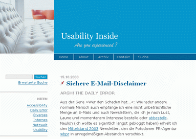
Usability Inside is the site that I found most appealing. If you have trouble reading it, that may be because the texts are in German. :-) The site is not only very usable, it also validates and renders correctly in all browsers on all plattforms that I use.
Yes, there are things that are not perfect. Currently it is running too long and there are too many links along the left hand side. But hey, it's an excellent start if you are contemplating a re-design.
Comments
I don´t like that it is basically a fixed width layout. On my 1280x960 Screen the content is a little bit concentrated on the left side.
Take a look at http://eclipse-plugins.2y.net/eclipse/index.jsp , it has a neat design, it´s not limited in width (though i haven´t validated the site)
Volker, thank you for this great motivating feedback. I appreciate this very much. Of course as always there's still much to do; today I'll reduce the entries on the home page from 15 entries down to 8 to »lose some weight«. Nobody reads all the entries anyway ;o) And the link list ought to be outsourced to my whole blogroll since weeks... hope this will happen soon.
Patrick, thanks for your feedback, too. Everything has its disadvantages. I use the same 1280width screen and find the design flaw not in width but in attitude: Perhaps it seems »a little bit concentrated on the left side« - but my layout is readable. I like your layout, but your lines grow up to 160 (!) types in a single line - no eye no brain does manage this reading efficiently. But, of course, it looks better ;-)
It's all about interaction and processing information. Layout should support this. In my company we do a lot of usability testing and observing users. Two observations: 1.) Users rarely change the size of browser windows. 2.) The bigger the screen resolution the smaller the windows.
i do really like it, quite clean, nice design, two small little flaws i found (or are they some sort of feature ;-) ??
first of all, the dark blue colored space doesnt´t fit perfectly with the first navigational button (home)...
and another thing: when resizing the browser window to a smaller width than expected, the whole layout gets messed up....
but except for that, i do really like it ;-)
Toby, thanks for providing your input! You're right; these aren't features but flaws. I tested UI only with 9 operating systems and 45 browsers - so, guess, there's some waste ;o) After some bug-fixing I decided to ignore 3 browsers: NC 4.x (hiding CSS), Opera 6.x and Mac IE 5.x do funny things with the navigation bar. I assume you visited my site with one of those? All the other browsers should render the site as it's supposed to - or at least present it quite accessible, even in the exotic ones like Lynx or Mosaic. I think that's okay for a private weblog (I hope)...
And referring to runtime: Now I minimized the entries on the home page from 15 down to 8, and the apache is now compressing the output. I hope it's running faster - at least a perceptible bit?
sorry to disappoint you, used browser was a ie 5.5 pc win2000... display resolution 1400x1050... i mean this point here:
www.shadownet.de/grafik.gif
kind regards
toby
Toby, thank you very much! Your screenshot shows the same result as Mac IE 5.5. This of course changes my point of view as over 9 percent of my visitors seem to use Win IE 5.x - unfortunately (why does one use that thing? ;). I'll fix this soon.
auch schönes Webdesign (sorry, German only site):
http://webdesign.raehr.de/
Mit diesem guten Beispiel voranzugehen lockt bestimmt zahlreiche Kundschaft an

