Favorite typefaces
by Volker Weber
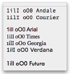 ... as well as not so favorite ones. Ths image shows the same string rendered with different typefaces. The characters are chosen carefully because they are so easily confused and make for hard to spot typos.
For all of my professional manuscripts I use the Andale Mono typeface because that works best for me. c't generally uses Courier and that is what I get back for proofread - if I ask for it. Never happens with my favorite editor jk though. Both Courier and Andale Mono are excellent fonts for proofreading. You can see that Andale Mono is even better if you want to spot the odd capital O that pretends to be a zero.
Most people use Arial. I don't want to rant about why Arial is not Helevetica (and worse than Helvetica), but I list it above for comparison. Times is the default serif typeface for most people and I like it although I find it a bit dull. Both Arial and Times are very bad for screen reading.
Georgia and Verdana have been designed as scalable screen fonts. But I still have a hard time editing in these fonts. This site uses Verdana as the default display font.
Finally there is Futura, my all time favorite (besides Frutiger, which I don't have). Not easy to read but very, very beautiful.
Comments
I always enjoyed the look of Apple Garamond.
Doing a quick Google tells that it is hidden away in every copy of OSX. OSXFAQ and MACOSXHINTS both have instructions on how to uncover it.
I found the hint but the font is not on my system. Do you happen to have it?
I'll have a look when I'm home. 3.5 hrs from now.
It is in the mail. I still run 10.2.8, so it must have been removed in Panther.
I was a little surprised when c't changed to a sans-serif typeface. I don't like to read longer articles in sans-serif typefaces.
Tobias
Since approximately a year, Apple has switched its' corporate typeface from Apple Garamond to Myriad. This caused a stirr in the Mac community last year, but has eventually been accepted. Personally I think Myriad matches the high-tech metallic look of the G5 and the PowerBooks, and also the Jaguar and Panther OS X releases, better than Garamond would have. Garamond was a better match for the colorfull and curved G3 iMac's and iBook's, and the plastic look of OS X 10.0 and 10.1.
Also notice that the crispness of Garamond and Myriad is not so much in the fonts themselves. It's the fact that they're condensed what makes them look so distinguished. You can test this yourself by creating a text with Myriad in Photoshop (I think the font is included) and adjusting the width of the typeface. The text looks so much better at 80% of its' default width than it does at 100%. Condensed fonts simply look more stylish. Take a look at Vowe's choices: Andale Mono and Futura. Both are slightly condensed fonts, while the fonts he doesn't like so much, Arial and Verdana, are not condensed.
Apple seemed to remove a few fonts in the move from Jaguar to Panther. For example, my site is done in Georgia, yet it’s not available by default in Panther (it was in Jaguar). Other casualties include Garamond and Palatino (the latter an old personal favourite).
na, da haben wir ja einen gemeinsamen Favoriten - Selbst meine Magisterarbeit war in Bitstream Futura gesetzt.
Since I do a lot of both on-screen and printed proofing, I have to agree with your hatred of a few of those. I'm a Verdana girl, myself, especially for on-screen reading... I still haven't found one that I love that my magazine will also love...

