Would it be OK to Cancel?
by Volker Weber
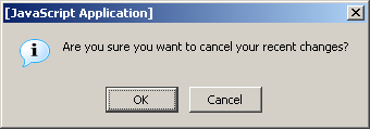
This is the message you get when you abort a new message in Domino Web Access, the artist formerly known as iNotes Web Access. Whoever designs these messages, and is there any usability review whatsoever?
It would not even be acceptable to ask "Do you want to cancel this message?" and to provide the options Yes and No. This is how you do it:
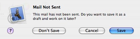
Yes, all messages in Mac OS work this way. Thanks, Ragnar, for reminding me.
Comments
Evan Williams of Blogger found a similarly evil dialog when trying to use Register.com. Check it out.
Awesome, I love the way apple/macos connects usability with design. This messages states the same but doesn't look as nice as yours. ;-)
That dialog is the stock Javascript dialog and theren't aren't many ways to do it in JS.
Bruce
They could at least change "cancel" to "discard"... :)
Better - but not exactly how to do it. Since the question just asks for 'Yes/No' resp. 'Save/Don't save' why offer three buttons then?
Because you have three options. Save, Don't save, or Go back.
Label No. 3 'Go back', then. :-)
Well this statement was pretty obvious, wasn't it?
To ask "Save" and offer "don't save" as the first option looks pretty stupid.
You will never get consistent dialogs in all cases of your application. Design a GUI and you will know. Not a very satisfying job ...
I'm afraid we've hit a sort of Goedel usability level here: There's no such thing like an obvios environment - some amount of implict knowledge is always required.
Kristof, you
1. have been a Windows userfor too long.
2. are a developer, and not a designer.
:-)
This is actually the style guide and it works very well. The default answer has to be affirmative, is preselected and always at the rightmost position. I cannot quote the source but usuability studies have shown that this is the preferred place a user looks at. To the left is the Cancel button. The third, negative button is always at the left, with a little bit of extra space to make sure it is not hit by accident. "Yes" and "no" are never permitted as options. You have to say what will happen when you press the button.
When Microsoft "invented" the GUI, their innovation was to put the affirmative button into the leftmost position and called it "OK".
Just remembered why the right most position is the best.
The computer asks a question. The user reads all the choices and then confirms the last one.
The user reads all the choices? Hah! That's the best joke I've heard all week ;-)
-rich
Volker, I disagree. The expectation of most users is (at least for small dialogs) is to click on the left button for the positive answer, since this is the actual answer to the question and you read from left to right. This may be a standard set by windows, but most people find it intuitive, too.
The only non-sensense in the first dialog you show is the fact, that the question itself uses the word "cancel". The developer probably does not know about the labels on the buttins, I cannot imagine a test method to avoid these thing with millions of dialogs.
(Note, I am not a *windows* developer)
If you really want the user to read the choices you have to change the positions randomly.
Otherwise you'll have the "Focus And Locus" effect.
Thank you guys for proving again, that there is a recipe for bad interface design. Let the developers do it. :-)
OK, that was a cheap shot. Let me explain:
Kristof, "most people find it intuitive" probably means "I do it all the times and it is OK". :-) I know that the default in Windows is the first button. And it is always just "OK" and the other choice has to be "Cancel". (There is also the standard "Yes", "No", "Cancel".) However, you have to read and understand the question. This is the problem here. The question is "Are you sure you do NOT want to save your mail?". And THAT is the problem, because the affirmative answer is "YES, i do NOT want to save" while at the same time confusing the user with the "Cancel" button, which contains the text of an affirmation of what he wants to do. Even intelligent people fail to answer negative questions correctly, especially if the cannot specify what they want and can only answer with yes and no, or even worse with OK and denial.
Now in contrast — and I am somewhat relating to Richard who knows that Americans don't read anything, because they have stupid warning labels everywhere (or is it the other way around?) — with the Mac dialog you don't even have to read the question. The buttons tell you what you will do next.
I know that for a Windows user it may look stupid to put the negative answer to the far left, but you will have to trust me on this. It has worked very well and I still have to give the first wrong answer on the Mac. And I have been a Windows user since 1.x.
Having said that, there are is indeed a problem with these dialogs: You cannot use the arrow keys to move the highlight. You can press Enter for an affirmative answer or Escape to go back, but you cannot select the negative answer without the mouse.
>Having said that, there are is indeed a problem with these dialogs:
>You cannot use the arrow keys to move the highlight
I came across that one yesterday: OSX 10.3:System Preferences:Keyboard&Mouse:Keyboard Shortcuts:
Check the checkbox at the bottom and you can finally navigate through Mac dialogs with the Tab key!
Actually it does more than that and is a pain elsewhere, but it is great for those dialogs.
OK, OK I am defeated, you still cannot use the *arrow* keys.
To Bruce:
Instead of using the naked JS function, you could popup a layer with the 3 buttons. It takes a little more effort... but you do that once and create a JS object to be recycled everywhere. Case closed.
In General:
We face the problem a lot, that once a dialog pops up user hit the enter key and the consider what the (now dissapeared) dialog was trying to say. How could one design a dialog that catches the attention (the reason for this behavior are the gazillions of meaningless dialogs that bother users on a daily basis).
;-) stw
This is again a question of good interface design. Let's take the example above:
iNotes catches the close window event. It wants to prevent the loss of data. A Windows dialog that follows the style guide would be:
"Do you want to save your edits in the draft folder?"
[[Yes]] [No] [Cancel]
If the user hits enter, you save the message as draft, if he hits escape, you don't close the windows, if he clicks on No, then he understands what he is doing.
So, if the user does not read the dialog, you try to do the least possible harm.

