Icons. Lots of icons.
by Volker Weber
Alan presents a a set of calendar icons which may or may not be in "Hannover". My first reaction was "My First Lotus". The second reaction was: They confuse the hell out of me. I dragged them off the web page and did a slideshow. For more than half of them I had no idea what they mean.
Then I checked Apple's iCal which hardly has any icons at all. Just some small hints that show if it is a repeating event. When you add an event, you hit a plus sign. There is no need to decide whether you add a meeting, an appointment, an anniversary, an all day event or a reminder. You just add an event. Then you can say, hey, this is all day long, and the time fields get disabled. Or you add attendees, which might turn this into a meeting. If you want a reminder, you turn on an alarm. If you want a "Notes Reminder" then the start and end time might be the same. It is actually pretty simple.
As I said, the icons confuse me. What I can live with is something like this in a web browser:
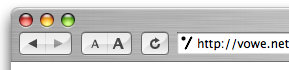
Back, forward, make text smaller/larger, reload. Period. There are more icons I could choose from. But then I would get more confused than necessary.
This was the beauty of the original Hannover designs. Hardly any icons at all.
Q: Who designed some of the most famous icons?
A: Susan Kare.
Comments
Hmm, personally, I have anniversaries which don't involve balloons. I have all day events which might span into time periods that I don't associate with sunshine. I also don't see why creating a draft of something means I need to do it twice.
The icons are very pretty but quite useless :)
I think you're just being a grump. I pulled them all into a slideshow and could get all but three, one of which was the i for information which I may even be right about but which I wouldn't have thought of as update. The other two I didn't get were From Invitee to Chair and From Invitee to Delegate, and both make some sense once I know them. In any case, it doesn't seem like the imost important point that you would know what they meant without being told. Most make a certain sense, and all probably have bubble help if you get confused.
As to the "My First Lotus" comment, I know what you mean, but that really does seem to be what people want these days. Not exactly my thing, but if people are constantly asking for eye candy, they can expect somewhat overly sweet results.
My friend Volker, I think you have in abundance that trait associated with Germans - a predilection for machine like complexity operating entirely behind spartan, simple, and understated controls. Even your eye glasses reflect this preference.
I happen to agree with you, but I think we both need to realise that the corporate end users and marketing people with all the money really like their pretty baubles, jubilant icons, and flashy colors.
Look at the default skins for Skype, or eBay.
You could always:
File > Preferences > Toolbars - Hide all toolbars
Hmmm... there’s a touch of “Noddy Goes To Toytown” about them (OK, so I’ve been watching a lot of Noddy lately!), but they do mirror the current fascination with the more superficial aspects of the Web 2.0 phenomenon: big, bright bold graphics.
So long as there's some tooltip-style text, they’ll do.
There seems to be a very “green” aspect to them: I wonder how this will sit with the blue-rinse of Hannover.
Andrew, I respectfully disagree. I don't think we share a common design idea. :-)
Re eye candy: Lotus has done it before. In 4.0 they introduced the letterhead graphics. Notes still suffers from that decision.
In my opinion, its important for icons to be distinguishable and to be learned easily. And I think, these icons are.
In the product you will see the icons in a context everytime. There is no need to "guess" what an icon meant there. I believe, it is not possible to create any graphics, that would be associated "right" by everyone, when there is no context. At least not, if the meaning is so specific like From Invitee to Delegate.
Volker
have to disagree completely. Not always simple means effective, I do want to differentiate between all day events, meeting and appointments for example, I even do have them show in different colors in my calendar, so I can immediately recognize what kind of event is a given one without the need to open it. The fact you can live with no icons in your browser/client does not mean everyone can do the same; I agree with Andrew, most of our users do like this kind of things. What is really annoying me is the fact that almost everyone has complained that Notes has a ugly UI; now we do go down the "eye-candy" path for the graphics, and there are complains as well..... I guess is really hard to satisfy people.
RoB
Perhaps, it is possible to make the new client "skinable"? Let the users and communities make new skins with colorful icons or with simple ones.
Personally I like lean interfaces, alot of white and grey with some colorful accents. And yes, I am german :-)
Roberto, ugly does not mean "underdecorated".
Volker
so now is "overdecorated" only ?
Volker -- I think you're confusing my tastes with my blogsite, which I know you find unusable. To that end, I suggested limited time and patience are as big a key as personal taste.
:-)
Users like eye candy. It's the little things and that's what Hannover is trying to incorporate - a lot of little things that will make a huge impact. I'm trying to incorporate more icons in some newer applications we're designing here. For the end users, the icons will not be distracting and I'm sure they will go over well. I sent the link to one of our power users and he said "Cool lotus icons".
Roberto, what I mean is: Notes is not missing icons. Notes is confusing because there are too many ways to do things. There are menus that you cannot change (you can only addstuff), "smart" icons, buttons on views, buttons on views that are actually menus, buttons with pictures and without, dialogs with pick lists, and on and on and on. Adding decoration does not fix this problem. It may make it worse actually. Why do you have to select a type of calendar event?
Look here:
Adding icons would not make this better. Or this.
Ye gods! My eyes! My eyes! (No, not the Lotus stuff, that last link from vowe).
Rob McDonagh made a comment on Alan's site thus:
why is it a problem when IBM produces a set of icons that could have come straight out of MS or Apple?
I would say it isn't a problem... but then these icons are hardly the sort of thing you'd get coming out of Cupertino (maybe Redmond).
If IBM insist of this icon set, that's fine by me, I'll live with it. I just hope that they stick them in one place—i.e. the relevant calendar form, as shown on Alan's site—and don't pepper the whole interface with them (as implied by talk of toolbars or action bar buttons). Things will quickly get cluttered and downright ugly if that happens.
Bottom line: the UI is going to be Eclipse-based. That means we should be able to replace the icons should the need arise ;o)
Volker, the toolbars (and I don't know if this applies to the action menus in Alan's second set of screens) can be set to Text Only, Icons Only, Text and Icons.
If those settings also applied to the action menus would that help. IOW if it was a *user* override for any decision a developer made in regards to icons in the action menu that may solve that particular issue.
I *think* partly what your arguing for is a simpler ui from Lotus in the *standard templates/interface* but not necessarily disallowing people to customize - have I got that correct - because that's slightly different issue than the path some of these conversations are taking and it may get lost.
The number of choices is a seperate issue.
I agree on the creating an item. I would rather just create the item and then decide/have the form help decide what it ends up being rather than doing it up front.
Volker is this you impersonating Steve Ballmer ?
Carl. Impossible. Do you notice the tie?
Stephen, yes, simplify - that is my idea. Not decoration. Why would I need to teach a user the difference between a meeting, an appointment, an anniversary, an all day event, or a reminder? Does it have a start time, when does it start, how long, does it repeat, do any other people attend, shall I block this time? THEN Notes can figure out what this is.
Can't disagree on the meeting side, it's part of the reason I've always found it odd having to decide up front. In the end it's the same issue your describing.
That one is certainly more difficult than a global settings to set Icon, Text, Text and Icons because it would be a behavioural change for a large installed base rather than a cosmetic one.
However I think your right from a user perspective. If you can accomplish the same thing with fewer decision points for the user it is better in the long run.
So does the global setting for icons vs text vs both help with the visual decoration aspect? As I said right now it doesn't apply to action menu items, only toolbars.
It would then be much easier to present Hannover to either audience - at least on the visual side.
Well Stephen, Notes spreads the functions all over the place. In the menu, on the toolbar, in the context menu, in the action bar, on the form. If you want to simplify you need to be able to switch things off selectively. If you make the toolbar display text only, you end up with one or severals menus under the menu. Cut, copy, paste will be in the edit menu, but also as a text menu again on one of the toolbars (and in the context menu). The first Hannover designs did not have toolbars, but I know they have been reintroduced in later versions. I am afraid that after a few iterations it will have gone full circle.
With new and shiny icons.
You really need to see these graphics in context. They are not toolbar icons, action bar icons, or menu icons. They exist on the meeting form, accompanied by some helpful text, like: Reschedule, or Meeting Update, or whatever. It's perhaps the only graphic on the whole form.
The mail form (in preview mode) looks pretty much like the pic above (without Volker's pic in the header!).
If you don't like to use toolbars, turn them off. I'm sure we'd get a lot more complaints if we removed them completely!
Keep the feedback coming.
Chris
Chris, thanks for the clarification. But are you saying that these icons won't then be used in calendar-related views? i.e. they will simply be in the Appointment form? They certainly look like updated versions of the icons we have in the Notes calendar now.
The ones that Alan showed are only on the form. We're still working on the view column icons.
Chris
I understand it spreads them in different places. However there is a big difference between configuring a setup once or via policies and having ui issues in/or not in your face everyday. I probably wasn't clear enough - what I meant by global was extending to other places the same selective control your referring to - it doesn't have to be a single switch. An yes main menus should be included. Nathan rasied these issues awhile ago. And no I wouldn't expect forms to be included unless they added a formula function as well :)
Ain't gonna happen inside documents I think.
As far as the "duplicating" issue within toolbars, to me that has always been a defect that should be addressed with the toolbars being smarter.
As far as menu vs toolbars you can customize the toolbars or they could come with a simpler vs the more complex set than the currently defined ones or they could be turned off altogther - ala Hannover. Ideallyt wha would be needed is for the defect to be fixed and a pass thru the toolbars to configure them for different themes as appropriate/described.
And yes you could end up back in the same place or not - it would be up to you or what was configured as default toolbars.
So then we could have a wow theme and maybe a vowe theme. :)
Looking for "solutions" that can get it most of the way there...wherever your where happens to be.
"Users like eye candy."
Users say they like eye candy. But they don't actually know what they want.
Apparently there is a lesson to be learned from The Homer
Volker
Chris answered already about icons and where they are (forms, vies, etc...)
You do not have to teach (I prefer the term explain) to people the difference between an appointment and an all day event. Is not so hard, I find it rather intuitive. When I am away for a full day is different from being busy 2 hours. You say "Does it have a start time, when does it start, how long, does it repeat, do any other people attend, shall I block this time? THEN Notes can figure out what this is." Well, I'd rather have Notes NOT guess what it is, but define it upfront myself. With your method, how would you book a full day ? Start at 00.00 and end at 23.59 ? Give me a "this is a full day event" option.....
Not always having many options is worse than having few imho.
Roberto, I have taught Notes to a four digit number of people. What is your experience in this field?
Regarding your question how to avoid having to ask the user if he wants to add a meeting, an appointment, an anniversary, an all day event, or a reminder, check out this dialog:
Timo - Ouch! Do you really mean it ? Are you one of those who divide the world in 2 ? The enlightened ones and the poor old sods who don't know what they want and have to be given what they really need (not what they think they need) by someone else ?
Volker, I never knew. You wanna catch-up? Since I have more hair than I know what to do with that would make me Herb. :)
Alan changed the pictures again...earlier in the piece, there were mini versions of some of those images sitting on action buttons!
Yes, we may need to document his "progress". Maybe I have them in a browser cache. :-)
Don't read too much into that Colin, nothing "sinister" on my part. I was simply trying to make the post easier for people to follow. I've been editing it based on everyone's feedback here on on my blog. (and emails and IMs) I started with what I thought was a nice fun post about showing some of the UI enhancements that could be part of Hannover. I originally provided no context as the post was not intended to "show a new feature". Chris Reckling chimed in and provided you more details.
Volker
i agree with you, a clear empty interface looks nice to a lot of users. This site shows your taste anyway. But...
...i myself even add icons for special tasks and like to use the additional fields available in the calendar. Additionally i use about 40 icons in the Windows launch bar. I like to have it all available NOW !
I know your mouse has to be real quick to handle that and my guys always complain about its unusability, but it rocks. May be this is my way to organize myself but that is how i learned while mixing music live. You need a handle on everything instant that's why digital consoles where unusable in the earlier day. No instant access, everything on its place on the right layer, but which one.
Back to Notes, two things about symbols:
1. There are three different kind of buttons, the small ones at the top, that's what Notes does (from the UI) with some additions for specials. Then there are the ones in action bars for views and documents and even inside the forms you find buttons, that's what is special for the application. They are from us or IBM to make an application usable in its context. They belong to us. And there are even some symbols on the right where users drop their favorite databases as they get a nice welcome screen instead a real workspace and have no other place to handle links. Which one would you drop?
2. I deal a lot with people from foreign countries and i like to tell 'em which icon to use instead of trying to translate my navigation path from my german os to their native language.
I don't like icons. Most applications have a floppy disk as icon for the 'Save' action. Do you know what? Most of the computers today don't have floppy drives anymore. Icons are hard to localize to other cultures because they could have another meaning in another country. Ballons for anniversaries? Why? Because of a birthday party?
Icons? The less the better.
If you want to build good user interfaces read this.
http://jef.raskincenter.org/humane_interface/thi_big.html
Alan, you did have action bar buttons with Accept and Decline icons, but they are gone now. Why?
Because I wanted to provide more context to the posting. I even updated the intro text to specially say that. "Below is a table of some of the potential new graphics which may be used (UPDATE) "on the calendar forms" in the next major release of Lotus Notes*." Therefore that image did not make sense anymore. I did not even hide my change, I put the word UPDATE in front of it. Gees!
Ah, OK. I found the graphics you removed interesting. I found they provided some context on how calendaring works in Hannover.
Nothing sinister taken Alan. I only mentioned it because of Ben Pooles comment "as implied by talk of toolbars or action bar buttons".
Given that I had commented about the action button images, I wanted to clear that up simply because there were icons on them in your second update.
Anyway, as you say, this is all subject to change. Which hopefully means taking the action button screen shot out means there will be no images on the action bar ;)
These aren't icons, they are graphics on a form. Why is everyone getting so worked up?
Good, I'm glad you found them interesting. When the code is public I'll certainly be doing a lot of blog entries focusing on specific features, such as "how calendaring works in Hannover". As I've pointed out (hopefully more clearly now!) that was not the intent of the current entry we've all been discussing. I simply wanted to show people an example of some of the great work the Lotus graphic designers are doing.
Hubertus, you can make your own application as complicated as you want. I was only referring to the stuff that Lotus ships. There are quite some templates in the current builds which are R5ish. It they are able to simplify the mail template and the Notes user experience, maybe they can also fix the other templates. And then you may want to copy the new lean style.
Charles, maybe because Alan's post is (currently :-)) titled "Sneak Peak - Calendar Icons". And we are not worked up. We only "Keep the feedback coming" as Chris kindly requested.
Forget about my personal hyper-sonic-icon-pimped-pc...
You are right, doing lean style is definitely the way to go. This is common sense i guess - talking about applications (databases). Icons and buttons are just an add on to have quick access to functions and navigation. The information is the important part, not the fancy style around it. But i will show you an example where some icons do a really good job. Have a look at Excel ( i think all versions i can remember) - where are the functions to:
Add a row
Delete a row
Add a column
Delete a column
You can not delete rows or columns as you have to delete cells in a different menue. Using the 4 icons to do the job is kind of lean - even if the solution would be more in a way to optimize the menue and get rid of the icons.
BTW: your design screenshot from this afternoon - how do you access all the additional functions - or are there none?
Hubertus, there are functions that appear as needed. Example:
Volker
I'd rather not go into this kind of discussions, but since you started it......
"Roberto, I have taught Notes to a four digit number of people. What is your experience in this field?"
I have to admit defeat, I stop at 3 digits. But I have been doing this job since 1994 so I have seen TONS of customers and spoke to them so I pretend I do know a bit about how people use Notes and what they want.
Should I ask you which version of Notes you started working with ? Nah! I could not care less, as I said I don't want to put the discussion at the level you are taking it..... It does not matter how many people you have taught Notes to, sorry, it does matter to understand that what you, Volker Weber, think about the Notes UI is just the opinion of ONE person. We have 120M other people using Notes and I guess their opinion is important as well, even if they never taught Notes to anyone.
The discussion stops here as far as I am concerned, if you want to follow up, well... you know my email address.
RoB
Thank you Roberto. I feel very honored that you came all the way down to talk to me.
Hubertus - all of the other functions are there on the action bar. We put Accept and Decline at the top so most users doing 90% of their calendar processing can have one-click access to it.
Chris
Oh - I can play, I can play. I started using Notes in 1992 and I also trained a three digit number of people on using Notes. With these qualifications settled, I say this:
The Notes UI sucks.
Plain and simple. (The UI, not Notes, I hasten to add) And so do most other UI's. Designing a UI to be simple and easy to understand must be one of the hardest tasks. (And I don't pretend, I'm able to do that, btw)
Like Volker I have come to appreciate the "seemingly" simple UI on many programs on the Mac. I have come to that realisation over the years, Taking away options from the user is "a good thing (tm)". Removing a single click in the chain of events is difficult, but very rewarding. Getting rid of visual noise (including icons) is good.
Jef Raskins book "The humane interface" was an eye opener to me. Quicksilver on the Mac gives us a bit of that interface - and boy does it make the user productive.
So - rethink the old paradigms - there are more humane ways to do UI development
Ah, okay, I missed that Alan called them icons, and I missed the accidental screenshots showing these in action buttons. All I ever saw was the half-billboard sized graphics that are going to be on the form itself. Some of the comments here aren't just feedback on the topic, it's a little more personal. ;-)

