Consider making your site readable
by Volker Weber
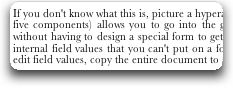
Once in a while I come across a site that I would like to read, but I simply can't. You don't have to be a great designer. But Baskerville is an extremely poor choice for a font to be read on screen at small sizes:

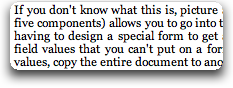
If you must use a serif font, Microsoft Georgia is a good choice:
Let's look at the CSS and find this:
html, body {font-family : Baskerville, Trebuchet, Helvetica, Sans-Serif;}
Baskerville is serif, the rest is sans serif. That looks very odd. And then it gets all overridden by
p {font: normal 1.0em/1.0em baskerville; text-align: justify; ...
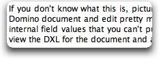
Don't get me started on justified text on screen. Anyway, if we dump all this nonsense, it becomes readable:
Design is the art of removing all decorations.
Comments
So true. I try to use only a few fonts on sites I create:
* Arial (with fall-back to Helvetica)
* Tahoma (with fall-back to Arial and Helvetica)
* Verdana (with fall-back to Arial and Helvetica) - mainly/only for headines/titles
* Georgia (with Fall-back to Times Roman)
I also try to keep the design clean without decoration that disturb the eye, softer colors and fairly strong contrast between items.
I totally agree with your definition of design.

