Office 2007 and Symphony on Netbook
by Volker Weber
For no particular reason I had the urge this morning to install Symphony on a netbook. It was a goner in a matter of 10 minutes. But I thought I'd share some screenshots comparing the user interfaces.

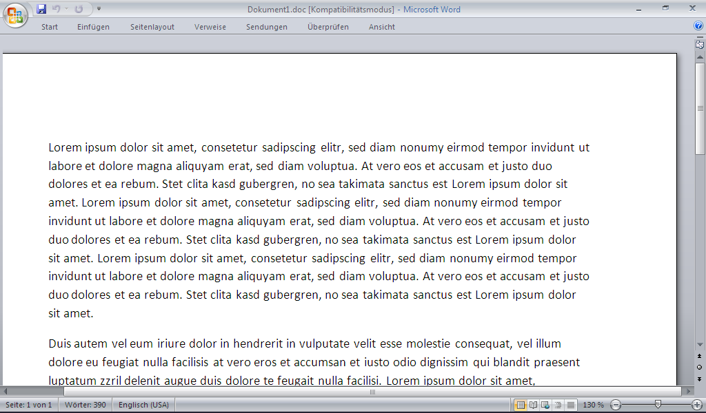
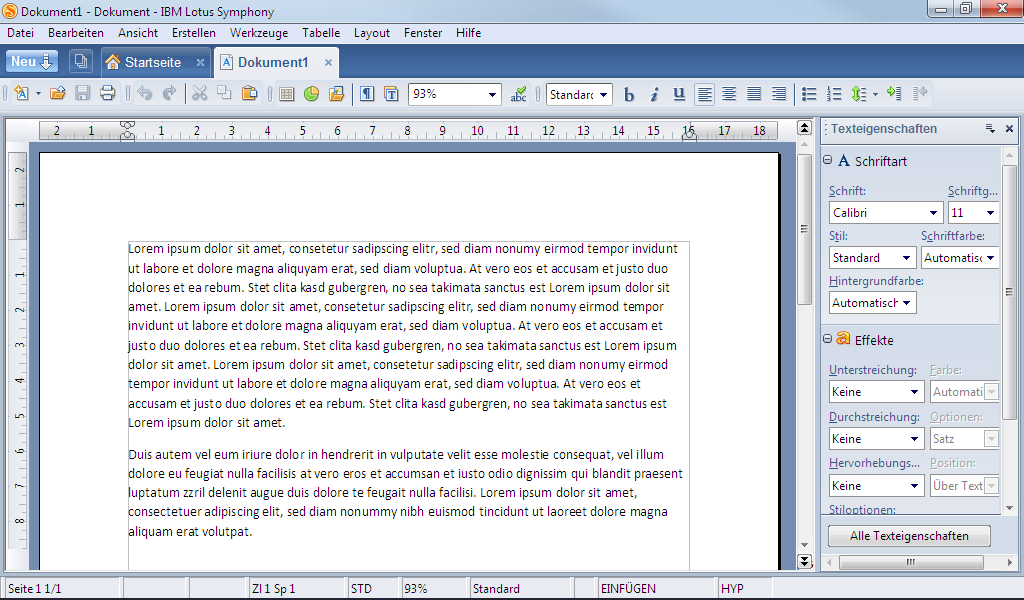
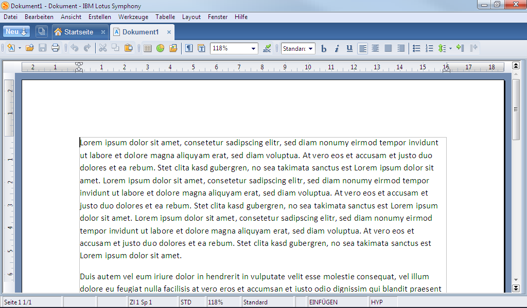
I need a distraction free environment. That's why I hide the ribbon with Ctrl-F1 when typing text. Did the same for Symphony with the sidebar. While Word renders the text very well with and without the ribbon, Symphony's readability is very poor with the sidebar on such a small display. No wonder, if it's automatically resizing to 92 and 118%, where Word uses 130%.
What's the real competition? Microsoft Word 2000. Has all the features I need, looks like Symphony without sidebar, renders text much better and loads in a fraction of a second. And I have a few copies on the shelf. Once again, the real Office competitor is an old copy of Office.
BTW: Why do UI designers still use floppies as a symbol for "Save"? They are long gone.
Comments
Why do car manufacturers still use manual gearboxes?
Because they can charge extra for a proper transmission.
Because the customer demands for it! Maybe it's the same with the Floppy ... what would you suggest, Volker? A CD, a DVD, ... ;-)
@Martin - a cloud ;)
Or a folder?
Nah, did not work.
I like the floppy disk icon. It's well established and highly recognizable. A folder could also mean "Open".
Thilo, the arrow coming out and going into the folder respectively, should probably sufficient for the distinction between open and save. But the main point is: once people are used to an icon, don't change it. It's a no-brainer. And you shouldn't need to think about the UI.
And vowe, may be you shouldn't think about the UI (too much) :-)
"The best Office is an old Office" - I agree. My last install was at version 2003. As for "save" = "floppy", I use a "storage vault" icon. Regarding automobile transmissions, manuals are for those who like control and automatics are for those who don't.
Because it's well known? What would you say, if you get a new application and don't find the SAVE function in the toolbar because the "creative" designer changed the icon?
I think it's not easy to change the symbol of a main function like SAVE, OPEN, NEW, ...maybe this could be an interesting task for a (UI) community in cowork with Apple, Microsoft, Linux ... ?
Suggest it to http://www.ixda.org/ ;) would be interesting.
Icon? CTRL-S is a lot quicker and the hands never leave the keyboard.
More importantly.... you changed your photo on the right again. Subtle, but noticable.
I don't agree completely. After a difficult start with Openoffice.org I got to like it more and more and use it a lot. Thing is: I can't really say why that is. And I don't really want to think of it.
Also: I like the floppy icon. It makes me feel so superior because I still know what it is and my kids don't. It is the small things in life ...
Show your kids a typewriter. :-)
Totally agree Office 2000 is perfectly adequate, and you can add the capability to open the docx etc. so that issue goes away.
As for the floppy, it's a matter of convention as others have said. Even the kinder who've never seen a floppy *know* what they look like. Changing the icon would be jarring to users and serve no purpose, kinda like the stupid ribbon that destroyed everyone's productivity by forcing them to re-learn the program. And if you want to talk about dated symbols, what about the quill pen for "Edit"? Again, hardly anyone of *any* age has seen one, but we know what they look like and understand their purpose.
Well, Kevin, I have seen quill pens, actually I was still forced to use a quill pen in elementary school. But I must admit, I've never tried to use one to edit an electronic document... However, as you say, by seing an icon symbolizing the quill pen, I get the idea. And you know what, Office's icon actually looks more like a pencil to me. As someone from IBM Research once told me when he gave me a pencil form their marketing material: We're all engineers, we do make mistakes!
Do you know why mounting a bike is always done with the left foot on the ground and swinging the right over it? Cause it the same side from which one would mount a horse. Because the sword sheath would be attached to your left leg, making it much more difficult and dangerous to try it the other way round. (The sword/sable being on the left is also the explanation why by formal etiquette the woman is supposed to go on the right side on a man, except in church were no arms are allowed, and the woman can go on the left)

