Does this Openoffice.org UI innovation look strangely familiar?
by Volker Weber
Comments
That is bloody awful.
It might make sense if a touchscreen were being used and a user were not able to use a mouse.
Say hello to widescreen and sidebar, not topbar.
Seems like Symphony is ahead now. :)
That UI isn't finished though, the publishers explain that they are just using text right now for buttons and not graphics yet, as it is a prototype.
Yuck, the Office 2007 Ribbon crossed with the Notes Workspace.
Idiots.
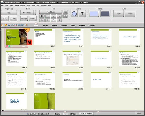
@Keith, it's not a workspace, it's the page sorter view in the presentations package.
I agree that they should come up with an Office look-a-like interface.
But from a version of Office that isn't 2007, like 2003, 2003, 2000, 97...
Keith, if all you have is a hammer, you see a hammer workspace everywhere. Even on the iPhone. ;-)
I wonder how many people who complain about the Ribbon UI have used it for more than 15 minutes? I still struggle with it after 2 years of use, but I do like that MS tried something new. But all the MS bashing is funny - its not like they didn't spend years of time and money on design and user testing. Change is hard to accept and blogs and twitter have put the spotlight on people who need to communicate their frustrations.
The style might not be right for OpenOffice.org, but they are trying something new. And letting people provide feedback before rolling it out in the product. I wish the Office and Symphony teams would do the same.
John, OpenOffice is a magnet for ABM (Anything But Microsoft). I am not suprised to see some Msft bashing there.
I have used the ribbon, and it works for me. I also welcome that Msft has innovated here. What I find strangely amusing is that somebody at OOo would copy the effort instead of coming up with their own solution. Maybe Msft is right with what they are doing, and OOo is complimenting that.
Volker, you should have mentioned that this screenshot is taken from a prototype used to sort commands. There is absolutely no button design implemented at this point.
I don't like the ribbon in Office 2007 but I do like the command panel that sines up whenever you highlight a piece of text. That brings about the most important formatting options right where your mouse pointer is. That helps a lot. I never really picked up the ribbon. I am propably to dumb for that and get lost all the time.
The comments to the original post often argue that a ribbon at the screen top is no good. Most screens are wide-screens these days and command panels at the side would be much better. I tend to agree on this point.
Oswald, I tend to agree as well. That is the part Symphony gets right. Not what's in the panel, but the placement.
It’s just all too much. Doesn’t matter whether it’s Office 2003 + or OOo, the interfaces are cluttered and plain ugly. Give me Pages / Symphony / TextPad any day!!
Office 2007 is not cluttered at all. See here >
Yep. We have seen this design before. It was called eSuite. So OO is the 2nd contender using this UI approach. Stop - they are actually #3. As part of the Eclipse Nebula project Hexapixel has created a SWT version of the ribbon (however I don't see it on the official Nebula site - yet(?)). So we could have a ribbon in Eclipse base applications (Symphony / Notes anyone).
Yes I like the ribbon. After you go through the unlearn phase it is quite easy to use. The only point of debate: if my workstyle requires a different grouping the ribbon makes is kind of hard.
Volker writes: "Office 2007 is not cluttered at all."
You are right. But this is exactly how my OOo.org looks as well. You don't click on menus while writing. Short cuts and the right mouse button is all you want.

