How Bullshit Detection works
by Volker Weber
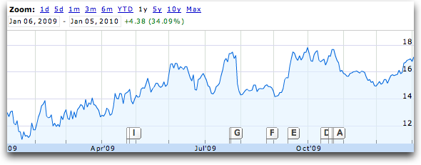
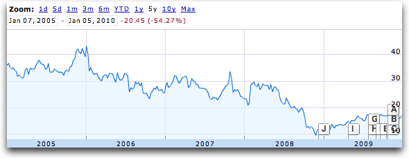
I am sure you noticed that all graphs you see in presentations point from the lower left to the upper right. They have to, as proof how well you are doing. You can play this game in Google Finance for instance. What you see above is Yahoo, year over year. It's looking good, isn't it? Only, it contradicts what you are thinking of Yahoo. You get to that if you step back a little and look at five years instead of one:
You also have to pay attention to the y axis. In the top most graph it starts at 11, not at zero, in an effort to show change instead of raw numbers. As you can see, this works both ways. Up or down.
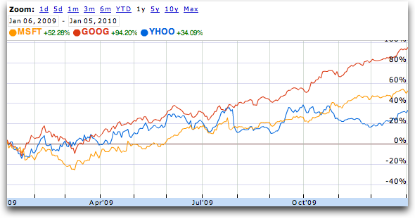
If you choose to look at one year, and then add the direct competition, you are also not as impressed as you were initially:
Now we step back again to look at five years:
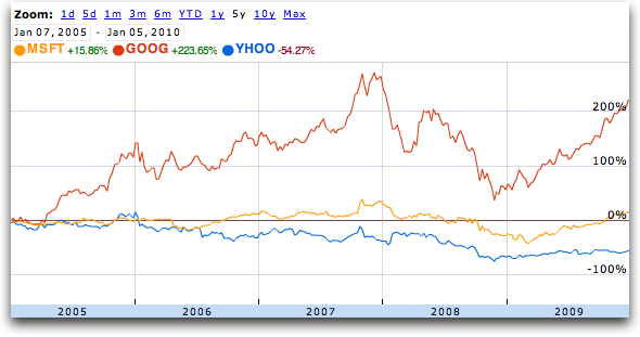
Or how about ten?
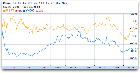
In all of those, Yahoo looks quite bad compared to the first chart that shows continued success. The trick is simple. Pick a good time frame. The bigger trick is to choose the right indicator. If most of your numbers don't look good, pick the one that does.
Looking forward to some great numbers in the weeks to come. :-)
Comments
soooo, do we have catchy chat in case we are in the audience when it starts?
Immer eine Frage der Betrachtungsweise oder des Einstiegszeitpunktes. Leider werden Zahlen meistens aus dem Zusammenhang kommuniziert und die Interpretation bleibt auf der Strecke. Einer der Gründe für mich, warum ich bei Frau Will und KollegInnen nicht mehr zuschauen kann.
Yahoo at least got an offer for 31$ raised to 33$/share but they denied (from Microsoft in 2008). For those great numbers in the weeks to come. Hardly anyone is believing them and maybe they are not important anymore anyway.

