Nexus One logo evolution
by Volker Weber
Comments
I think I can see the twin towers.
Sieht irgendwie Schei*** aus. Und typografisch erst recht . Das "x" passt garnicht in den Schriftzug rein. Stört total den Lesefluss.
Hello, I'm a PC. Google sucks when it comes to graphic design. Nothing Google does looks desirable. Google is even worse than Microsoft. But a smartphone is more than a smart phone. It's an attire and an attitude. It tells a lot about the user. The Nexus One just tells me: "Hello, I am a PC. I am a nerd and that's why I don't care about my outside appearance."
Hubertus, they care a lot about UI design. They just don't care about eye candy.
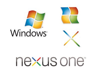
No need to rotate the Windows logo for the colors. The Google logo already has those colors in the right place:
Timo, what you call eye candy, Hubertus calls graphic design. So you agree, and you care less than Hubertus does.
Timo, there is no doubt that they care about UI design. But that's about all. Just compare the Nexus One with an iPhone, a Palm Pre or Nokia's N900. They all look less cluttered and are much better designed. And they all have their own unique design language. If it weren't for the Google logo at the back, hardly anyone could tell it's a Google phone. It just looks like any wannabe smart phone. Or look at the logo and compare it with the iPhone logo. Which one looks more self confident (has less eye candy)? Or look at the user interface of the Nexus One: Why this useless distracting desktop background? Why are the icons so small? Hey, there is enough space. Just have a look and decide yourself. You need to have more than a "don't make me think" design for a phone. A phone for the mass market needs to be loveable. The alternative is to be much much better than all the other cool phones.

