Google is dropping the ugly
by Volker Weber
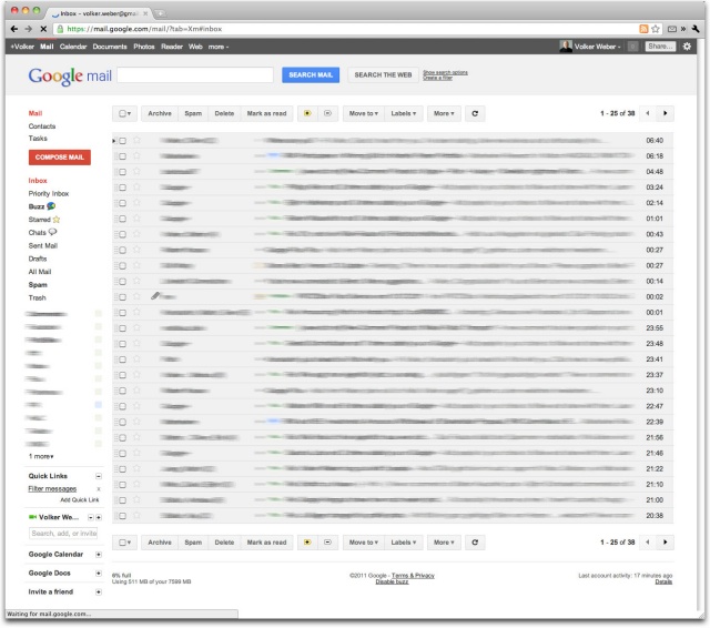
If you are a GMail user, go into Settings/Themes and select Preview or Preview (Dense). I like.
Comments
Der Tipp des Tages. Besten Dank. Herrlich kuehl und kantig.
Now all Google need to do is bring their paid-for service up to the same level as their free GMail offering so that everyone can use things like these new themes (or Analytics, or Profiles, or Google +…)
The paid-for service is the enterprise version. By definition, it has to be slower, more expensive and with more restrictions. Talk to your IT administrator.
gestern hab ich noch geschaut, obs zur neuen navigation bar auch ein passendes theme gibt. schade, dass sie im neuen theme nicht auch schwarz ist...
ähm, ja. reload - dann ist sie schwarz/grau, wie ja auch oben im bild zu sehen... -.-'
The paid-for service is the enterprise version. By definition, it has to be slower, more expensive and with more restrictions. Talk to your IT administrator.
LMAO. I’ll talk to him, but he can be very obstructive :-)
Looks good.
I wish they'd do something for Google Reader, too.
Calendar is next. Don't know if Google Reader is still a priority.
looks good, but not quite fit in 1024 x 768
1024 x 768? Is that from the last millenium?
1024 x 600 = all the netbooks
Or the iPad.
Nice theme. Thank you.
thanks - calendar changed yesterday automatically to the new layout
Yeah,
this looks so great!!
calendar already done...
1024x768 is netbook or small tablet
Don't like. Went back to "Green Sky" immediately.
Nice, though even Preview (dense) is a bit spread out for me for GMail. Also, my enterprise IT administrator assures me that he selected all the "beta test everything please, I want to be on the bleeding edge" button, but to no avail.
Horrible. There is no contrast between the colors (or more accurately the different shades of light grey). I haven't seen an email application that ugly since, well, Notes...
Strangely, Preview (Dense) is more spread out than my current Them, Classic...
Looks great, except if you have an Inbox Zero. Then everything looks lost and you don't get that satisfied feeling, compared to Mail.app or Sparrow.app. But a big improvement together with the new Google Calendar. BTW with Google Apps the Google bar seems to be white.
vielen Dank für den Tipp!

