Two notable changes in Sonos 5.0
by Volker Weber
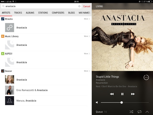
Sonos has just released version 5 of their software and new beautiful controllers all around. The iOS controller is now universal. If you cannot find it from your iPad, search for the iPhone app in App Store and you will get the universal app. Two notable changes:
- You can now search across all services.
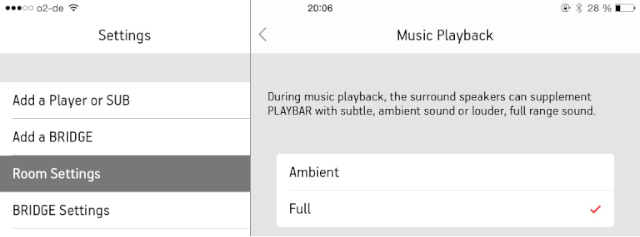
- Surround channels can now play at full volume instead of ambient.
This stuff is getting better all the time.
Comments
A Great update. Much more visual - i.e. album art instead of text lists. Update process was flawless.
any idea if this fixes the max # of songs issue? I looked online and cant see either way
What issue? That you cannot index more than 64k tracks? No, that's not possible as I understand.
Surround speakers at full volume is a great feature. I don't know how many times I grouped and ungrouped the Play:3s in the last 14 months.
But I wonder why they didn't incorporate the feedback from the public beta. The only bug I found and reported (2 months ago) made it to the final version: In the German version "Interpreten" is shown twice in the global search: Once for Last.fm and once for all the other services.
Unfortunately the search across all services didn't make it into the desktop controllers for Windows and OS X. Probably we'll get this in a future release.
Nice update, indeed I almost thought the Windows / Windows Phone version was already here ;)
Fresh look is nice, but many useful functions are now hidden or in second level (e.g. changing rooms, list of songs to come). The art work gets way to much space (this is about selecting and listening to music, isn't it?), looking through the Sonos forums apparently I am not the only one complaining. Glad that the old iPad app is still working ...
I am sure there are people who do not like the changes. But I am sure that many people like the more engaging experience.
I think the v5 controller is decent on the iPhone, but it's just dreadful on the iPad. What used to be a concise, one page list is now a nightmare of scrolling, digging for options, and poor overall usability. Sonos Favorites (with their giant tiles/icons) are buried under the line-in and services/subscriptions icons. Sonos Favorites are the first thing I want to see; that's the point, right? And yet, regardless of the available screen real estate, and with all the graphical bloat, important touch "targets" like the room choice and the "group" buttons are in TINY text.
Judging by the Support forums, I'm not the only one who feels this way. Perhaps they need a "power user" mode for those who don't just want "pretty." Our collection has grown to three players (1, 3, & 5), but the v5 tablet software is a huge disappointment.

