Navigating the Sonos 8.0 app
by Volker Weber
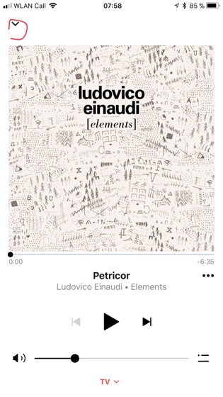
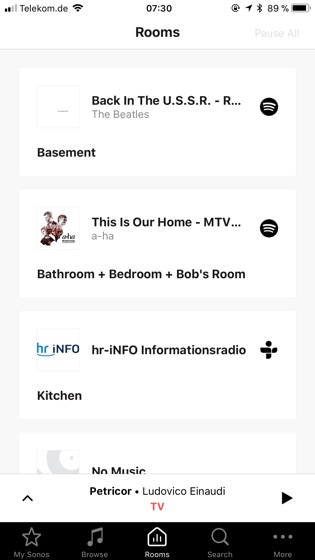
The apps have been redesigned to look more like the iOS 10 Music app and they only use black & white with some red accents. At first I was completely lost in the Now Playing panel until I learned you have to use these two carets to get in and out. You can also swipe the panel up and down.
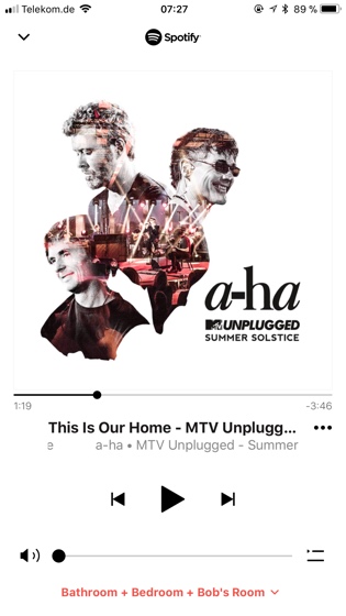
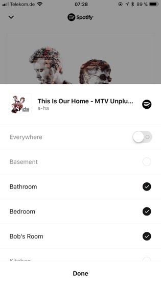
If you tap the room name in the Now Playing panel, you are not taken to the rooms screen. Instead another panel appears where you can select which rooms the music should play in. This makes it easier to transfer music from one room to the other.
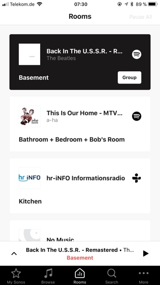
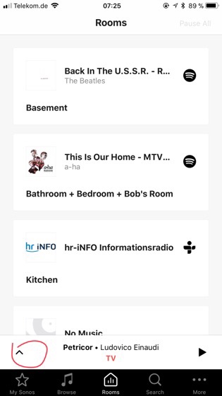
When you tap and thus select a room in the Rooms panel the Group button uncloaks. To get to the room you have to tap the room again. If you tap the group button the same sheets appears that you get when tapping the room name in the Now Playing panel. This is redundant.

There is a very simple fix to make this design so much better. Instead of showing More ... on the main tab switcher, replace it with Now Playing. Then you don‘t have to hide the bar in the Now Playing panel and it becomes much easier to move around. You can then hide the leftovers behind a caret in the upper left.
Comments
Glad to see that others were confused by the new design, too. It looks goods but it is harder to use from my POV. Hope, a quick fix will come soon. Had really happened that something got worse at Sonos. Normally, it only got better over time...
Change is difficult. The old app wasn't necessarily better. Just more familiar.
I find the new app very confusing. The bottom bar should just always be shown and not slide in and out.
And I do not understand why there still is no history available, showing what we have heard.
Agree with all of you: "The bottom bar should just always be shown"!

