

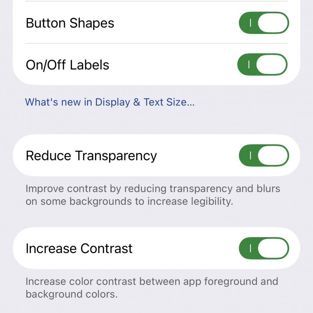
These four settings undo most of the damage in the new iOS 26 user experience. Button Shapes show you the area where you can tap, On/Off Labels clearly show which options are on (=1) or off (=0), Reduce Transparency makes Glass effects opaque and Increase Contrast makes text readable.
For me, someone who didn’t use the betas and so was not primed with the (potentialy bad) state of Liquid Glass then, the new UI looks quite ok. So, for now I do not consider it a damage and will leave it on.
Where are those settings? I can’t find them in „Anzeige und Helligkeit“ where I would expect them…. Ye, sorry, German os 🙃
Der nächste Punkt unter Allgemein. Accessibility im Original. Man muss das aber nicht wissen. Einfach meine Überschrift in der Suche der Einstellungen eingeben.
Danke. Gut versteckt.