

Raluca Budiu for the Nielsen/Norman Group (NN/G):
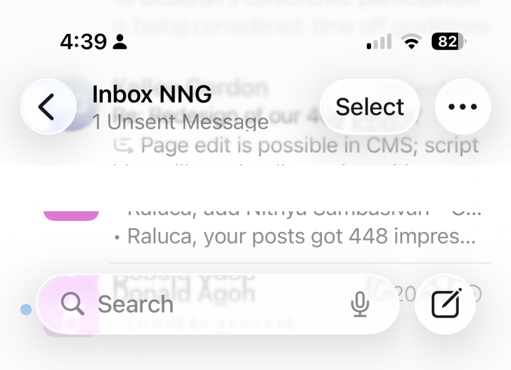
iOS 26 brings Liquid Glass controls laid over noisy backgrounds, jittery animated buttons, shrunken and crowded tab bars, collapsing navigation, and ubiquitous search bars. On top of that, it breaks long‑established iOS conventions, getting closer to Android design.
Overall, Apple is prioritizing spectacle over usability, lending credibility to the theory that Liquid Glass is an attempt to distract customers from iOS 26’s lack of long-promised AI features.
The interface is restless, needy, less predictable, less legible, and constantly pulling focus rather than supporting seamless access to content. Instead of smoothing the path for everyday tasks, iOS 26 makes users relearn basics while enduring a constant parade of visual stunts.
Apple may call it Liquid Glass. To many users, it feels more like a fogged‑up window: pretty from a distance, but frustrating when you try to see beyond it.
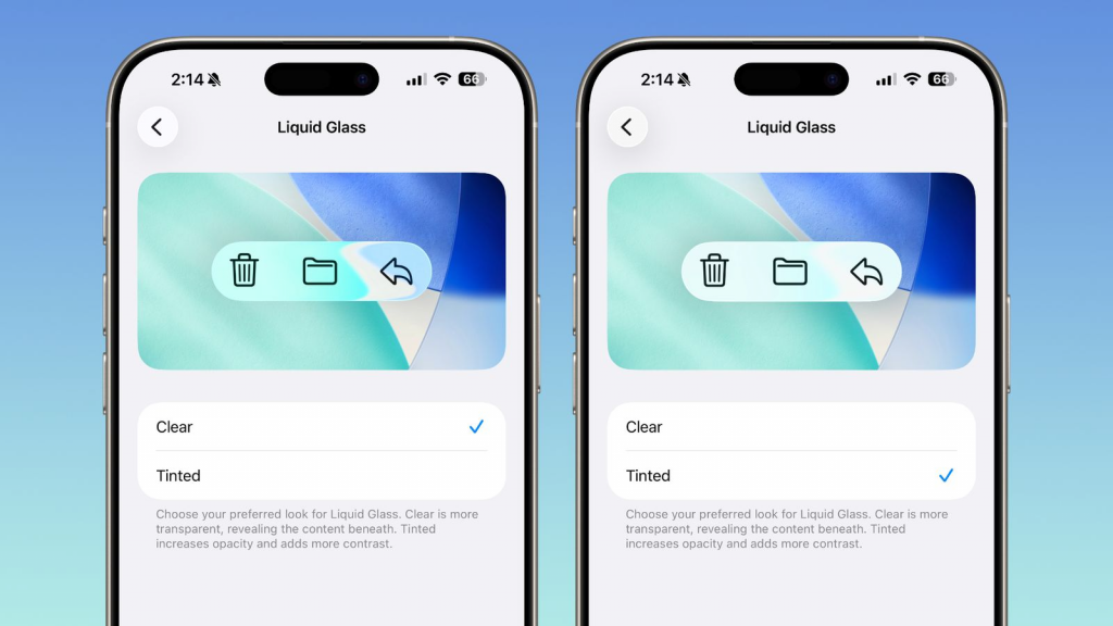
Update: Macrumors reports that Apple starts to fix Liquid Glass by giving you the option to remove transparency in 26.1 beta 4. It may take half a year but I expect Apple to undo the damage it did with 26.0.
Ja, Liquid Glass hat einige Schwächen. Dennoch bin ich im Grunde froh darüber. Die Apple-Designsprache seit IOS7 und OSX Yosemite war IMO katastrophal. Aqua war gut benutzbar und attraktiv. Die Zweidimensionalität und der Minimalismus danach war alles andere als ein Fortschritt.
Aus meiner Sicht hat Apple bei Liquid Glass einen Kompromiss gesucht: das Design nicht völlig umzukrempeln und dabei etwas mehr Dreidimensionalität zu erreichen. Das Ergebnis leidet dann unter Inkonsistenzen an jeder Ecke.
Ich hoffe, dass Version 26 nur der Anfang war und in den kommenden Iterationen die Design-Katastrophen der letzten Jahre korrigiert werden.